By Steve Waller
It seems paradoxical, but often we define our cities by their green spaces. Franklin Roosevelt once described forests as the lungs of the land, and parks play a similarly vital role in the lives of our cities. They offer both an oasis of calm, and a hub where people can meet and socialise. As time goes on and an increasing proportion of the human race take up residence in cities, the way green spaces are designed and used is only becoming more important.
One of the biggest challenges civic planners will face will be arranging such areas so as to feel somehow free of the urban crush surrounding them. With space at ceaselessly increasing premium in most conurbations, this is no easy thing to achieve.
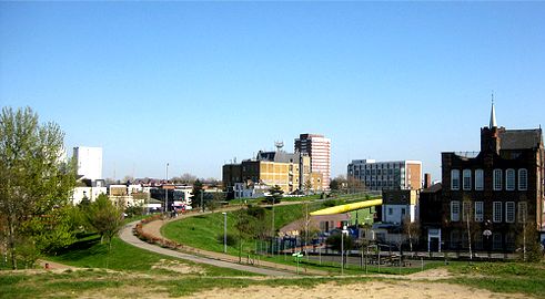
One great example of a successful solution to this conundrum can be found in east London’s Mile End Park. The park is pretty much linear, laid out in a narrow stretch for 3km. As you’d expect for a piece of parkland of this size in such a densely populated area, the space is inevitably intersected by a major road, some minor roads and railway viaducts. Obviously, having these interruptions wouldn’t do much to help the park in its “˜oasis of calm’ capacity.
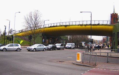
A great get around to this fragmentation was devised by local resident Piers Gough of CZWG Architects, who designed the 25m wide “˜green bridge’ as part of the park’s regeneration at the start of the millennium. Bridge engineering experts Mott MacDonald helped complete the structure (also known by locals as the “˜banana bridge’ owing to its yellow underside) which spans Mile End road at a height of 5.7m to allow any trucks among the 75,000 that pass under it each day to pass.
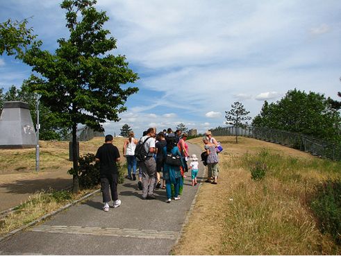
The bridge acts as an extension of the park and features 30 trees along the grassy length of the two 7m wide landscaped strips beside the walkway. For those crossing the park, the impression of unbroken space is comparable to the affect of an infinity pool, as it blocks the view of the traffic below.
The bridge’s construction comprises a 150mm thick concrete deck which is laid out over permanent glass fibre reinforced plastic (these are the panels the form the aforementioned yellow underside) with support provided by 1380mm deep steel girders spanning 32.5m. The bridge’s abutments use reinforced concrete and, due to the fact that London Underground tunnels run from the nearby station at a shallow depth, piled foundations were used to divert loads from potential stress points.
Furthermore, the base of the bridge has been disguised using a green-tiled façade and turned into a retail space, with the rent paid by business to trade there going along way towards paying for the park’s upkeep. A great example of cunning design and sustainable planning.
Note: See more photos from CZWG Architects.
~ Steve Waller
Steve Waller is an environmental blogger who takes an interest in all things green, architectural or otherwise. For more of his thoughts visit his blog, GreenSteve.com.
 Greenroofs.comConnecting the Planet + Living Architecture


