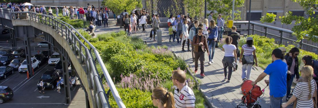
A Comparison of the Three Phases of the High Line, New York City: A Landscape Architect and Photographer’s Perspective
“A Comparison of the Three Phases of the High Line, New York City: A Landscape Architect and Photographer’s Perspective” compares Phase One with Phase Two, and describes what is proposed for Phase Three. Design features to be reviewed include the walk system, seat furnishings, plantings, signage and graphics, water feature and drinking fountains, public art, lighting, maintenance and irrigation, and Phase 3. The author also offers suggestions on economic impacts, restrictions and user activities, sustainability, and studies/research.
Originally, due to the length and photo essay nature of the contribution, the series was presented approximately every few weeks in 14 parts between 2013 and 2015; to ensure background information, the Series Introduction is repeated on all.
Part 14 – Conclusion
By Steven L. Cantor, Landscape Architect – Originally Posted February 27, 2015
All Photos © Steven L. Cantor
Series Introduction
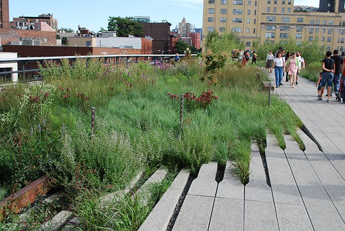
Phase One High Line on July 15, 2009.
Designed by landscape architect James Corner of Field Operations, architect Ricardo Scofidio of Diller Scofidio + Renfro with planting design by Piet Oudolf, the High Line, the remarkable linear park built on an abandoned railroad viaduct in New York City, has been enormously popular.
The design team anticipated how well green roof technology would function and adapt to the viaduct since it could handle at once the huge weight of several fully-loaded trains carrying heavy tonnage. As an intensive green roof, it has very few structural load limits which would curtail use. At peak use times there can be lines of pedestrians waiting to enter with as many as 20,000 visitors per day on weekends.[1]
The High Line has won numerous awards, and in particular several as a green roof, for example, in 2013 and 2010 from the American Society of Landscape Architects, Green Roofs for Healthy Cities in 2011, and in 2010 from the International Green Roof Association. This is a rare public project in which the success of the initial phase contributed to a high level of funding for subsequent phases.
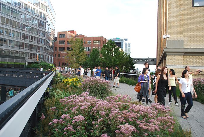
7.16.11.
The High Line has benefited from intense scrutiny as a result of lectures in which the designers were questioned; public hearings, media critiques in newspapers, journals, and blogs; lobbying from specific organizations, such as the Rainforest Coalition; and comments from city government and other public officials.
Improvements or adjustments were implemented to some design elements of the first phase, and significant modifications were done in the second phase. Are these changes aesthetic, appropriate and ethical, and are they consistent with the goals of sustainability? Is the High Line a sustainable design?
Part 14: Conclusion
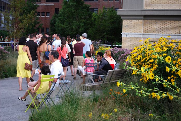
Enjoying the High Line on 7.16.11.
The High Line is a signature achievement in urban park design that works best when it’s the simplest. The array of versatile plant materials, planted in unique ways that evoke a sense of joy and wonder, completely disguise that this linear park was once an abandoned railroad trestle thought to be a major eyesore in a developing neighborhood. The sheer variety of experience which the designers have achieved in a narrow space is remarkable. Yet, at times it feels like a theme park with a crunch of pedestrians trying to squeeze into a new group of amusements every block.
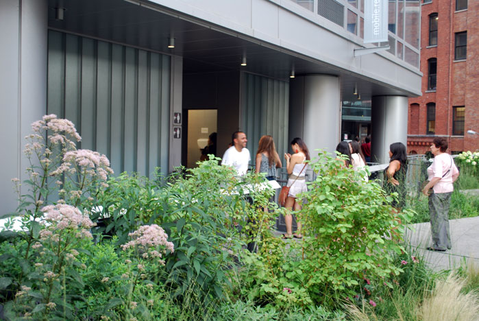
The restrooms near West 16th Street are often quite crowded; the only other location of restrooms on the High Line is at Gansevoort Street. None have been provided in the recently opened third phase; 6.10.11.
In their exuberance to provide a total experience with such special features as interactive sculptures and videos, the design team has not always provided the most effective common denominators. For example, although it’s perhaps a nice touch to have a drinking fountain that speaks to you or a restroom facility that communicates ecological messages or films that project on walls at night, it might have been a better use of resources to design the infrastructure so that the drinking fountains and water feature would be in use all year round, and not shut down during the winter, an often festive season in New York City when the weather provides a perfect invitation for a brisk or leisurely walk.
Given the uniqueness of the design, that is, with many elements created innovatively from scratch, and not specified from catalogs, it is to be expected that the first attempts may not always work, and require prototypes. Adjustments to the first prototypes are often needed. It is difficult to imagine the extra hours of work required of the architect and landscape architect, and reviewing agencies.
Yet, the more complex the detailing of these important vocabulary elements become, the more challenging it will be to maintain them. In the first two phases water fountains were designed whose runoff replenishes the plantings. In the third phase a new tweak in the design of the water fountains, a rising stainless steel column from which the water emerges, does not seem to be operating properly as yet, perhaps due to a lack of adequate water pressure. The use of knee high cables strung between metal posts to prevent people from walking into the plantings and from tripping on some of the irregular pavement edges has not been entirely successful and requires constant upkeep.
On my last walk on the High Line I saw from a distance a woman take a bad fall when she tripped over one of the cables that had settled down to ankle height, where it was hardly visible. Although shaken up, she was fortunate not to have injured herself.
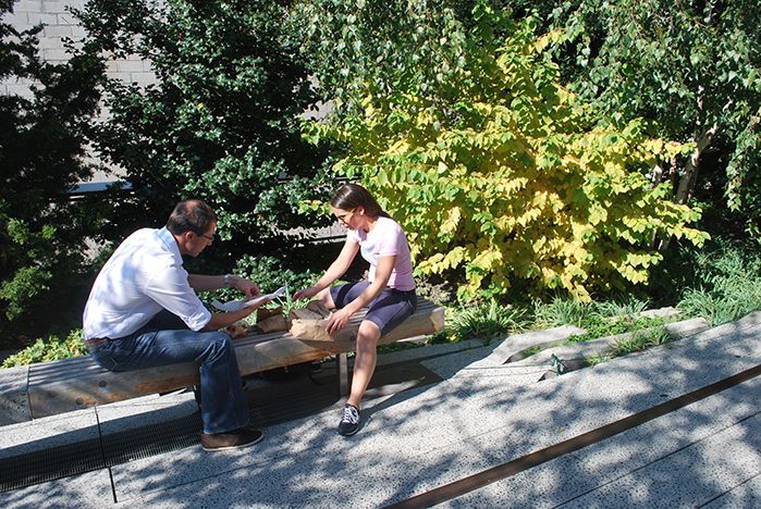
Just behind the couple sitting on the bench a woman tripped on the ankle high cable barely visible in this image. The cable is more typically at knee height but there is a lot of variation in height depending on the anchoring devices and the setting. 10.17.14.
The Friends of the High Line, which has done a comprehensive job advocating for the park and then helping to develop and maintain the implemented design, is in the midst of a $150 million fund-raising campaign to fund Phase Three and provide a continuing endowment for operations and maintenance, with $85 million already collected.[14]
Yet, some of the activities which the Friends have encouraged such as the large food court near 15th Street, have resulted in intense maintenance problems. On a recent visit to this area, I was amazed that the formerly whitish gray concrete planks are so discolored as to appear almost black. There was also a concentration of litter and chewing gum stains right at the point where the design itself and related art installation originally emphasized the view of the Hudson River.
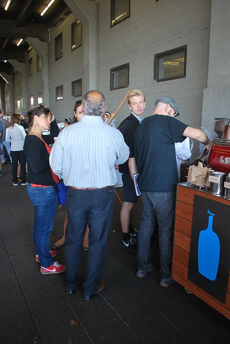
As a result of intensive use, the plank pavement on the food court has become stained almost black; 10.17.14.
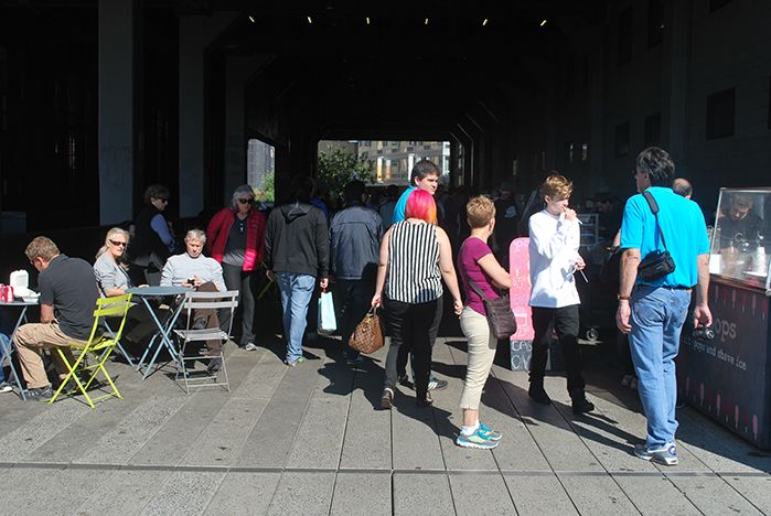
The food court and shopping area is usually crowded with visitors; 10.17.14.
This shopping mall atmosphere detracts from the High Line Art webpage’s stated goals for artists “to think of creative ways to engage with the uniqueness of the architecture, history, and design of the High Line and to foster a productive dialogue with the surrounding neighborhood and urban landscape.”[15]
The subtle colors and symbolic representation of the Hudson River as realized by Spencer Finch’s poetic installation, “The River That Flows Both Ways,” are overwhelmed by the sensory overload of the food and shopping court.
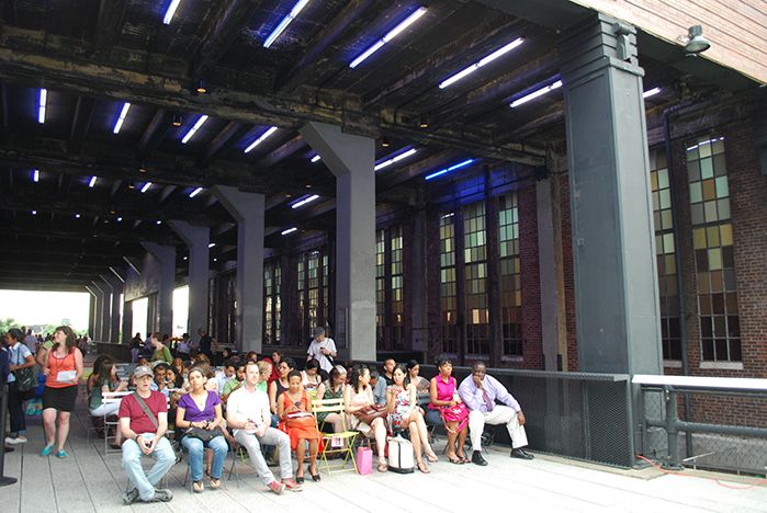
In contrast, the people above are seated to the side of the glass panels of The River That Flows Both Ways art work, waiting for a lecture on 6.16.11.
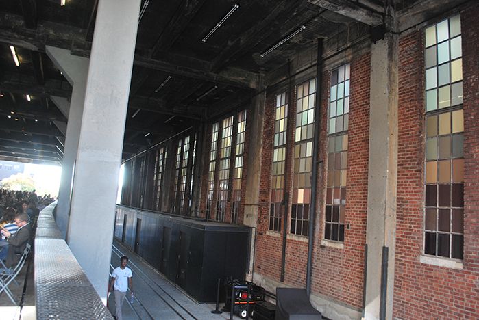
As the shopping and food arcade to the left gets busier and busier, no one seems to notice that permanent art installation celebrating the Hudson River in the wall to the right; 10.17.14.
The High Line has invigorated Chelsea and stimulated development of all sorts of new restaurants, shops and apartment buildings.
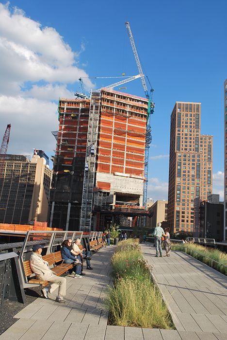
A view looking east on the third phase as the High Line approaches the first major building under construction as part of the Hudson Yards. 10.08.14.
The risk is that with the completion of Hudson Yards, the entire fabric of neighborhoods on either side of the High Line corridor, from the Village and Meat Packing District to Chelsea and Hell’s Kitchen, will become an enclave for wealthy tourists. Yet the city has finite resources for parks and recreation.
If the combination of funding provided by both the city and the Friends of the High Line declines significantly, then there will be major challenges as to how to maintain at a high level such a complex landscape. Newer attractions may require a shift in maintenance resources. The High Line design team indicated that they were inspired to create the design after viewing the Promenade Plantée (French for tree-lined walkway, it is now known as the Coulée verte René-Dumont) in Paris, another linear park built over an abandoned railroad trestle.
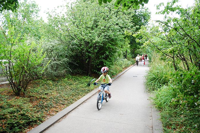
The Promenade Plantée features a much simpler walk system than the High Line so it can readily accommodate bicyclists, roller skaters and dogs, all forbidden on the High Line. 7.18.09.
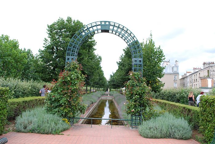
French for tree-lined walkway, the Promenade Plantée often screens views of the city in contrast to the High Line which often brings visitors right to the edge of the trestle. 7.18.09.
The Promenade was initially very popular and drew large crowds when it first opened, but over the years it has not been as thoroughly and intensively used. Some areas have fallen into disuse, and maintenance has lagged considerably. When I visited it in 2009, the one elevator was broken and out of service; graffiti proliferated and many planting areas were in need of maintenance.
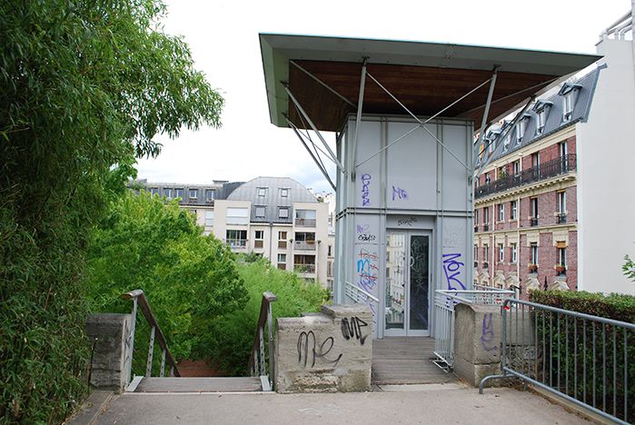
The one elevator on the Promenade Plantée was not functioning when I visited Paris in 2009. Sporadic elevator breakdowns have occurred on the High Line, the most serious due to damage from Super Storm Sandy. 7.18.09.
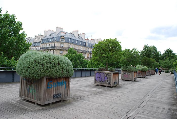
Graffiti have proliferated on the Promenade Plantée as both park usage and maintenance funds have both decreased; 7.18.09.
This pattern must be avoided with the High Line. Yet, in the third phase just completed, a stretch of almost 1/3 mile (0.21 miles) there are no restrooms or elevators incorporated. The nearest restroom is at 16th Street, about a mile from the entrance of the High Line at 34th Street, and the nearest elevator is at 30th Street where the second phase ends. It is troubling to have such a lack of basic services for one of the most intensively used linear parks in the country, all the more so since the success of the first two phases surely underscored how high the usage would be.
A special playground for children with adult supervision has opened in the middle of the third phase, yet there are no restrooms. What are the children supposed to do? Given the very high level of use by thousands of pedestrians, it is a tribute to the design team how well the High Line has held up. However, there are certainly significant maintenance problems: occasional loose planks, planks with broken corners, wood furniture that is no longer aligned, severe staining of the pavements which need cleaning, myriad tasks relating to plantings. These are certainly manageable tasks if the budget is available to fund them.
An unusual corollary of the intense use and complex design is how many users of the High Line manage to find private spaces for intimacy even within this intensely crowded urban park. It’s typical to see couples having private moments or intense discussions on benches in offset areas despite the thousands of people walking by.
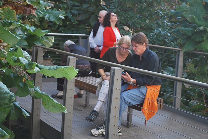
Within the area of one side seating area off the Falcone Flyover, one man manages to read privately, while two couples have separate interactions; 10.1.14.
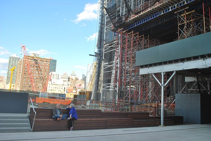
Pedestrians, and perhaps New Yorkers in particular, have developed the art of creating an intimate private space in the middle of large public areas; 10.08.14.
It should be acknowledged that the High Line is a managed green roof landscape which, nonetheless, challenges traditional public perceptions of what is beautiful.
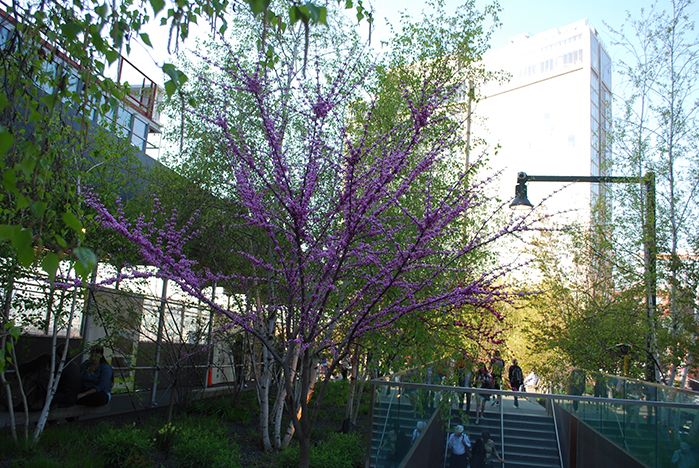
Redbud, Cercis canadensis, in bloom alongside river birch, Betula nigra, at the Gansevoort entry; 4.27.13.
The grass and other perennials are not always green, but at times are fully in bloom, or brown or dormant, or even appear dead. This analogy of change and senescence over time is an important one as the continuing development of the Hudson Yards and other major real estate projects nearby will undoubtedly require rethinking or renovations to some aspects of the High Line.

A variety of grasses on 12.01.13.
It is appropriate to educate the public — in guided tours, on the High Line’s website, through lectures and public displays — that such plant materials, and communities of plants are vibrantly alive and part of the natural world. Unfortunately, the latest changes to the www.thehighline.org website (as of the original posting – February 27, 2015) seem to focus on selling merchandise and raising funds, rather than to educate.
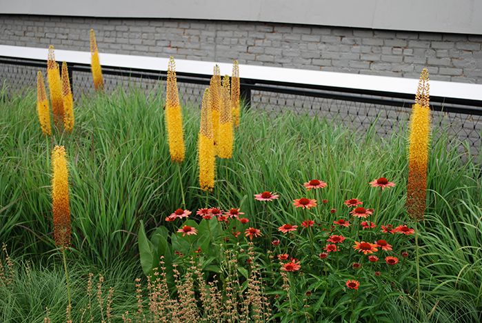
Foxtail lily, Eremurus stenophyllus, with Rudbeckia sp in foreground; 6.12.10.
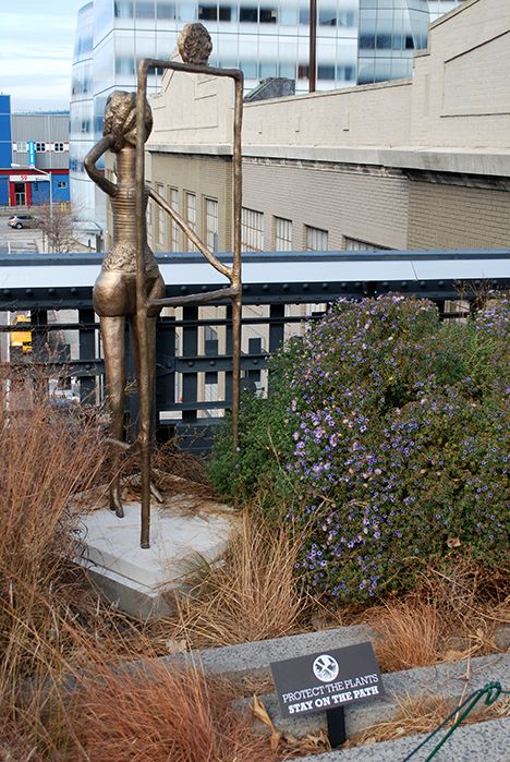
Some of the public art installations appear to crowd the inhibit the plantings rather than enhance the experience of park visitors. Ruby Neri’s Before a Framework on 11.30.13.
There is no longer easy access to plant lists, or photos of the High Line under construction and as realized, except a Flicker site. The educational goal may come in conflict with the remarkable array of public art projects incorporated into the High Line. I am not certain that the two can continue to gracefully co-exist, unless the function of the art is to educate the public and protect the plantings.
At the same time, it is important to acknowledge the level of expertise and maintenance necessary to keep the High Line functioning as a beautiful park for generations of New Yorkers and visitors alike for years to come.
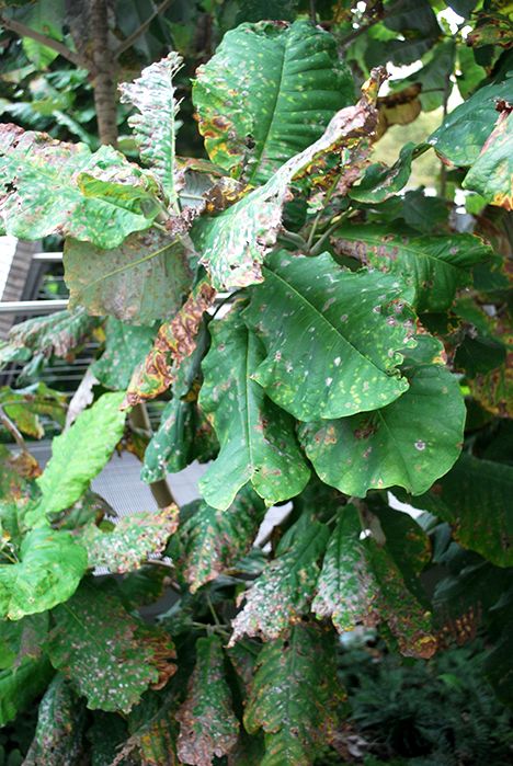
Although most plant materials have done well, some, such as this magnolia — whose leaves have been shredded in a windy location — must be monitored and replaced. 10.15.14.
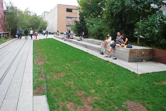
The irrigated lawn requires a great deal of maintenance, including rest periods when it’s fenced off, in order to stay functional. 10.15.14.
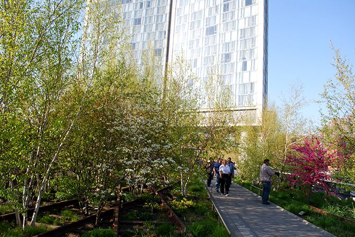
Gansevoort Woodland at the top of the Gansevoort Stair; 4.27.13.
In conclusion, the High Line is a magnificent achievement in urban design, park planning and sustainable green roof design which has the potential to last for generations.
I hope that these different sections of text and images of my 14-part series of “A Comparison of the Three Phases of the High Line, New York City: A Landscape Architect and Photographer’s Perspective” will generate discussion.
Steven L. Cantor
Photos © Steven L. Cantor are available for individual purchase.
Cumulative 14-part “A Comparison of the Three Phases of the High Line, New York City: A Landscape Architect and Photographer’s Perspective” Series End-notes
1. Ulam, Alex. “Back on Track,” Landscape Architecture Magazine. Volume 99, No. 10, October, 2009, p. 97.
2. http://www.thehighline.org/news/2012/01/24/major-milestone-for-the-high-line-at-the-rail-yards
3. http://www.thehighline.org/sustainability
4. http://www.thehighline.org/design/planting
5. Ulam, Alex. “Back on Track,” Landscape Architecture Magazine. Volume 99, No. 10, October, 2009, p. 97 and 105-106. He refers to an article in the New York Post.
6. David, Joshua, Reclaiming the High Line, a project of the Design Trust for Public Space with Friends of the High Line. Karen Hock, editor, (New York, Ivy Hill Corporation and others, 2002). p.7.
7. http://www.thehighline.org/about/ask-a-gardener
8. http://untappedcities.com/2013/10/17/live-blog-from-2013-mas-summit-for-nyc-day-1/
http://untappedcities.com/2012/04/26/partners-in-preservation-the-high-line-section-3/
http://untappedcities.com/2013/11/13/spur-the-third-section-of-the-high-lines-crown-jewel-a-nest-in-the-sky/ (by Bhushan Mondkar)
9. http://www.thehighline.org/sustainability and http://www.thehighline.org/about/faq
10. http://www.thehighline.org/about/faq
11. Cantor, Steven. Green Roofs in Sustainable Landscape Design. (New York, WW Norton, 2008). p. 34 (Several additional definitions are provided. It is possible to measure sustainable elements precisely, from carbon footprints to other calculations, but that is beyond the scope of this discussion.)
12. http://www.thehighline.org/sustainability
13. http://ticcih.org/wp-content/uploads/2013/04/ticcihbulletin55.pdf is just one example, from the International Committee for the Conservation of the Industrial Heritage.
14. http://www.thehighline.org/news/2012/01/24/major-milestone-for-the-high-line-at-the-rail-yards
15. http://art.thehighline.org/about/
Publisher’s Note:
See Steven L. Cantor’s ENTIRE 14-part “A Comparison of the Three Phases of the High Line, New York City: A Landscape Architect and Photographer’s Perspective” Series.
Steven L. Cantor, Landscape Architect

Photo by Thomas Riis.
Steven L. Cantor is a registered Landscape Architect in New York and Georgia with a Master’s degree in Landscape Architecture from the University of Massachusetts, Amherst. He first became interested in landscape architecture while earning a BA at Columbia College (NYC) as a music major. He was a professor at the School of Environmental Design, University of Georgia, Athens, teaching a range of courses in design and construction in both the undergraduate and graduate programs. During a period when he earned a Master’s Degree in Piano in accompanying, he was also a visiting professor at the College of Environmental Design at the University of Colorado, Boulder. He has also taught periodically at the New York Botanical Garden (Bronx) and was a visiting professor at Anhalt University, Bernberg, Germany.
He has worked for over three decades in private practice with firms in Atlanta, GA and New York City, NY, on a diverse range of private development and public works projects throughout the eastern United States: parks, streetscapes, historic preservation applications, residential estates, public housing, industrial parks, environmental impact assessment, parkways, cemeteries, roof gardens, institutions, playgrounds, and many others.
Steven has written widely about landscape architecture practice, including two books that survey projects: Innovative Design Solutions in Landscape Architecture and Contemporary Trends in Landscape Architecture (Van Nostrand Reinhold, John Wiley & Sons, 1997). His book Green Roofs in Sustainable Landscape Design (WW Norton, 2008), provides definitions of the types of green roofs and sustainable design, studies European models, and focuses on detailed case studies of diverse green roof projects throughout North America. In 2010 the green roofs book was one of thirty-five nominees for the 11th annual literature award by the international membership of The Council on Botanical & Horticultural Libraries for its “outstanding contribution to the literature of horticulture or botany.”
Steven’s most recent book is Professional and Practical Considerations for Landscape Design (Oxford University Press, 2020) where he explains the field of landscape architecture, outlining with authority how to turn drawings of designs into creative, purposeful, and striking landscapes and landforms in today’s world.
He has been a regular attendee and contributor at various ASLA, green roofs and other conferences in landscape architecture topics.
In recent years Steven has had more time for music activities, as a solo pianist and accompanist. In 2011 he performed a solo piano program at the Winter Rhythms festival at Urban Stages Theater. He’s a regular performer at musicales hosted in Chelsea and other settings in Manhattan. On August 25, 2013, Leonard Bernstein’s birthday, he performed with Stephen Kennedy Murphy a program of excerpts from the composer’s MASS and Anniversaries.
Steven joined the Greenroofs.com editorial team in December, 2013 as the Landscape Editor. In February, 2015 he completed his 14-part series “A Comparison of the Three Phases of the High Line, New York City: A Landscape Architect and Photographer’s Perspective.”
 Greenroofs.comConnecting the Planet + Living Architecture
